One of the senior most type designers from India, Mukund Gokhale’s plethora of work includes Design Parameters for Devnagari, Terminology for Indian Scripts, Writing systems of Indian regional Scripts, Manuscript analysis, design and calligraphic studies, Frequency evaluation of phonetic and graphic characters, Type designs for metal types, photo-typesetters, optic, laser, Mechanical and Electronic typewriters and digital systems for a variety of scripts. He is the Founder member of Institute of Typographical Research and has published various books articles on the subject. Aksharaya is honoured to have had him as a speaker for Aksharsanvad.
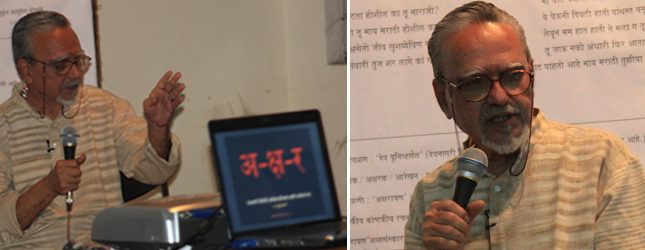
In his introduction, Gokhale narrated his experiences with Type design and letterpress printing. He started his presentation by showing several examples of incorrect typography commonly visible across newspapers, magazines, educational and entertainment oriented books, advertisements and television. He asked the audience why such mistakes are tolerated. He made the audience aware of the problems existing in this field and the need to resolve them.
He spoke in detail about the Devnagari script- its characteristic features, its structure based on the phonetic point of articulation, its principles, process of forming consonants conjuncts, vertical and/or linear joineries, placement of matras, sequence of reading, correct placement of matras and standardisation.
Gokhale elaborated on the correct usage of the anuswar and explained as to where, how, and in what size the anuswar should ideally be. It is important that it should not be to bold or too light. It should be placed above the danda (vertical bar) of the characters. He also emphasised on how the size and placement of the anuswar needs to change in case it has to be used alongside different matras.
He mentioned about the research by A.B.Walawalkar on the development of Devnagri from a prebrahmi script called Maheshwari and about panini’s contribution to the devnagri that is in use today.
He then presented his work on creating the terminologies for the anatomy of Devnagari and also his comparison of the proportions of Devnagari letterforms to the human body in the times when no such standardised terms were in use. He believed that this knowledge would enable calligraphers, typedesigners, punch cutters, type foundries, printers to discuss the issues in creating/ drafting letterforms to improve the process of production.
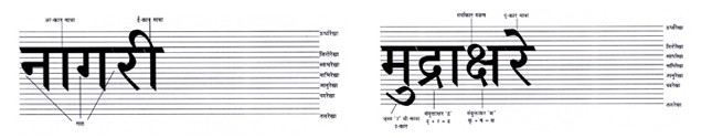
He also explained in detail, technicalities for construction of Devnagari letterforms like the correct proportion, various componants/ parts, optical illusions and how to tackle them, grids, changes in letterforms as aresult of changes in axis, changes in thickness of verticle stroke based on the weights from extra light to extrabold.
He emphasized on the importance of testing to find out about how a typeface appears across different point sizes, the variation in strokes which form the letter, proper placement of the matras, overall density and colour of the page, readability, legibility and line length. For testing he suggested the following shloka which includes all charcters from अ to हः अनेकवर्णक्रमरीतियुक्तःकखागघाङचछजौझञटंठःअडण्ढणस्तऽथदधौनपंफुलबभौमयुरोलवशेषसिंहः
He then showed several examples of Devnagari typefaces including the most popular ‘Natraj’, ‘Yogesh’ and ‘Mitra’ and explained the reasons for their popularity.
Finally he expressed a wish to see many more Devnagari typefaces being designed and more people be made aware about them. He recited a poetry written by himself and dedicated it to Prof. R.K.Joshi. Though this extremely informative session, Mukund Gokhale left the audience impressed by the depth of study required by the subject. He gave scripts a holy status and hoped that they will be worshipped by people for ages to come.