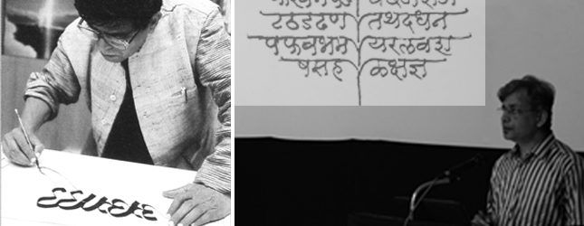
Title of the talk: RK is RK (Re-introducing R. K. Joshi)
“Today, we are privileged to take a peep into the sketchbook of a legend called R.K. Joshi”, said Prof. Vinay Saynekar, about Prof. R.K Joshi, a designer whose passion and love for letterforms has inspired and created generations of design conscious people.
Prof. Saynekar having had a very long (1981-2007) and extremely close association with R.K, enligh – tened us by sharing, some of R.K’s work, commercial as well as personal, and his philosophy of life.
Born in Sangli, in 1936, a boy who had originally aspired to become an engineer, R.K.’s contribution to the world of letterforms in India, is unparalleled. His active involvement in the field was right from his young age. In 1956, while he was studying at Sir J.J. Institute of Applied Art, along with his fellow students, he organized an exhibition called ‘Know Thy Character’.
He started his career with D.J. Keymer, as visualiser. He was one of the founder members of Ulka Advertising Agency, where he spent more than 2 decades of his professional life. While at Ulka, he was responsible for several graphic design and advertising work for brands like Dalf, Nerlolac, Mukand Iron etc., which later were marked as milestones in the print advertising industry. He also designed logo and symbols for Punjab National Bank, Welcome Group, Crompton Greaves, Chimanlals, Namaskar (in-flight magazine of Air India), CEAT, Indian Post etc. In all his graphic design too, his love for Indian letterforms is clearly reflected. At the peak of his flourishing advertising professional career, R.K. decided to explore the world of academics. He was appointed as member of teaching faculty at the prestigious Industrial Design Centre, IIT Powai, Mumbai.
In the mid-sixties, R.K. was seriously ill and was hospitalized for several months. But this year, proved to be one of the most fruitful years of his life. While he was unwell, R.K. started studying Indian handwritten letterforms, historical aspects, their styles, construction, tools and surfaces. He burnt the midnight oil in the Asiatic Library, situated at Horniman Circle, Mumbai, where he endlessly copied and studied styles from several manuscripts. This calligraphic duplication and study of letterforms includes Siddham, Jain and also several styles of Devnagari writing. His study later was responsible in creating his own calligraphic styles which he named as Kadambnagari, Vakranagari, Sindhunagari etc. One of his styles was Dnyana Nagari. The style is based on the letterforms which were prevalent in the period of the noted Marathi saint-poet Dnyaneshwar. R.K. took this ahead to the level of a full fledged Devnagari typeface.
His work on the visual form of words was not just restricted to traditional usage. He was very experimental in his explorations. He loved to create patterns using letters. He also explored the sound aspect and expressed it visually through arrangement of letterforms. He designed many calendars and diaries for Chimanlals (Handmade and decorative paper stationary shop) and was also responsible for several cover designs of a periodical publication called ‘Satyakatha’.
R.K. taught us to SEE words. Also, he was an extraordinary copywriter and poet himself. His poems are visual poems or concrete poetry. He printed his poems with distinct layouts, specific fonts and arrangements of the letters to express their meanings due to which he even incurred the wraths of many established poets, for having given little more importance to the visual aspects along with the actual literary content of the poetry.
R.K was known to stage an interesting happening every month, to create awareness about Indian letterforms among public. From greeting people with a sea of flags each bearing a letter from different Indian scripts, to painting letterforms on the t-shirts of participants celebrating the ‘Govinda’ festival in Mumbai, R.K., organized 12 such ‘happenings’ for one full year at various locations in and around Mumbai.
To spread awareness, R.K. designed and organized exhibitions solely dedicated to Indian letterforms. These exhibitions were at a national level and offered interesting insights into the letterforms. Aakar, Prathama, Aksharmarga, Awahan, ‘A’, were some of them.
Along with research in history of letterforms and his attempts towards creating awareness in the present, R.K also played a very important role in developing the future of Indian language typography. He developed with his colleagues at National Centre for Software Technology (Now C-DAC) a font design software called ‘Vinyas’. The software used skeletal approach to design letterforms. The fonts created with ‘Vinyas’ were used by Indira Gandhi National Centre for Arts, Delhi.
He later developed the font ‘Mangal’ for Devnagari, which was followed by fonts for other scripts. The Indian script fonts which are available and seen in the MS Windows operating system are designed by R.K. and his team of font designers. Later, he developed the ‘Jana’ series of Indian script fonts for Linux. Some other fonts include ‘Vidya’ (used on the certificates of Mumbai University) and ‘Suchi’ (used for the directory of telefax numbers of Delhi region).
R.K’s contribution to the world of Indian typography is unmatched and his school of thought remains as a guideline for all who wish to contribute to the world of letterforms.

