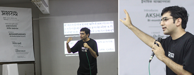
The first session of Aksharsanvad was conducted by Girish Dalvi who was pursuing his PhD at the Industrial Design Centre in the Indian Institute of Technology Bombay. His PhD research included areas such as, History and Ontology of Devanagari typefaces, Indic Typeface Design, Indian Language Computing, and Classification Theories. Being the very first session; the presentation was structured to include basic knowledge about Indic script typography, specifically Devanagari typography, so as to be relevant for audiences with little or no formal exposure to the subject.
Girish presented historical and contemporary documentation on Devanagari Typography and opened up several areas for discussion. These included Devanagari typographic history — a brief overview of social, cultural and technical perspective. He started with the importance of asking questions with the example of the history of the question mark. He also encouraged the audience to recognize the Devanagari fonts used in the slides of his presentation and presented the audience with a wide range of historical Devanagari typefaces and their designers.
He presented some of the earliest books to be printed, such as the “The Diamond Sutra” (वज्रच्छेदिकाप्रज्ञापारमितासूत्र, and of the earliest Devanagari books to be printed, such as “Purchas, his pilgrims”, “China … illustrate” and “Hortus Indicus Malabaricus”. He advised students on how they could gain access to good and rare books from libraries around the world by writing to them. Giving an example of an early 18th century “Rudra Purana” manuscript, he illustrated the characteristics of Devanagari manuscript calligraphy and compared them to the earliest printed books. The manuscripts had a dense, dark texture with connectivity in the letters and catenation marks. He also showed a Jain manuscript from the 15th century and gave credit to it for being an excellent example text justification, grids and image-text harmony. He compared these with the Alphabetum Brahmanicum (Rome, 1771) and Systema Brahmanicum (Rome, 1791), the earliest two books printed in Devanagari movable type. Giving a social reference to the time he explained that these attempts were made by the Vatican to print the bible in regional languages. Later on changes were made in the print with the introduction of the punctuation marks, and a new system of connection called the degree system was used for Matra connections.
He shared his views on the role of regional scripts on the socio-cultural ethics of a community. Illustrating examples from the book “Reminiscences of Imperial Delhi” by Thomas Metcalfe (1843) he displayed a letter written by Bahadur Shah Zafar in honour of the Governor General in 1843. He also presented and discussed the first printed Sanskrit Bible. He showcased books written by the colonial British in English giving vivid descriptions about their cultural experiences in India; he discussed and compared this English book aesthetic with manuscript aesthesis from the same period.
Moving towards the technological evolution of Indic typography, he presented the work of the Nirnayasagar type foundry which laid the foundations for majority of the current digitalized Devanagari typefaces. He spoke about their documented work ethos, wherein they considered the documents as holy and took great efforts to match the print with the dense texture of the manuscripts and every character was custom made with intense detailing. Speaking of hot metal printing, he showcased examples of monotype and linotype printing and explained the problems faced in this method. These problems were later evaluated by Prof. R.K Joshi by his studies and comparisons of linotype printing with Jain manuscripts. He introduced the audience to the most famous Devanagari typefaces and their type designers such as Natraj and Yogesh and gave due credit to their designers. He then spoke about the problems faced when people tried to adapt Devanagari to the typewriter by reducing the number of glyphs.
Commenting on how the social milieu of the British era affected the development of printing, he mentioned the Swadeshi movement by Gandhiji which brought about a moral conflict amongst people with respect to using British printing techniques for the freedom propaganda and also the fear of printing secular documents.
He displayed the two types of glyph systems used in metal type, Akhand and Degree, he put forward an open discussion on whether the Matras used should hang or fall and asked for justifications to either. He elaborated on the different ways of giving the Shirorekha (headline) and the problems faced by them. He also demonstrated his method for Devanagari text justification using extensible Shiro-rekha.
He covered basic information about the English and Devanagari typographic terminologies and suggested Typography of Devnagari by Baburao Naik, Ganesh Vidya, books by Vinay Saynekar, N.W. Gokhale and K.C. Aryan as good introductory reading material.
Talking about the present work in typography he spoke about the trend of designing English typefaces and then working out the Devanagari and other regional typefaces to match them. Designing visually harmonious structures between various scripts is a huge challenge in India. He suggested that the motive today should not just be to design a font but to design a system to test its working. He emphasized on the importance of learning the technicalities of the system of converting a visual into a working font and said that designing a traditional Devanagari text typeface is one of the toughest projects to handle.
To sum it up, Girish was very informative about the basic technical and historical aspects of Devanagari typography and portrayed the various areas of study in the field thereby simulating typographic sensitivity and curiosity about the subject in the audience.