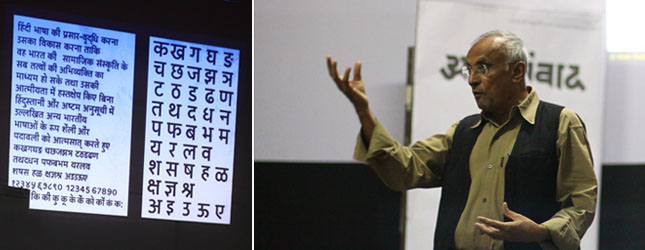
Winner of the 4th Gutenberg Award, Mahendrabhai Patel, spoke about his 40 years of professional experience in Font map and Signage Design. Mahendra Patel is a retired senior faculty member from the National Institute of Design (NID), Ahmedabad, India.
As he began the session, he narrated an instance where he was asked to deliver a design that would look international To this, Mahendrabhai refused and said, Since this is a design for India, it should fulfill the needs of the Indian audience, but what I can assure you is international quality rather than international Style It is this that justifies his design philosophy that, Design should not just be seen, but the problem should be solved.
One of his initial commercial projects, in 1979, was Type Design as well as Exhibition Design for a theme pavilion, Delhi. In the same year, he also started work for the International Airport Authority of India on Type Design in Devnagari, Bengali and Tamil. After that came the project of designing the logotype for State Bank of India (SBI), in Devnagari, Bengali and English. Through experiments, he proved that while designing the same logotype in another Indian language/script, the text should be translated in the respective language and not transliterated. His impeccable work on the logotype of SBI, in all languages demonstrates that a perfect logo is the one where we can see visual similarity in the original logo and the other language logos, with respect to colour, structure and also balance and rhythm in the various scripts used, making them a family inspite of their differences. The SBI logo was created in, Assamese, Bengali, English, Gujarati, Hindi, Kannada, Malayalam, Marathi, Oriya, Punjabi, Tamil, Telugu and Urdu.
He then spoke about his experiences during the signage development project for Ahmedabad city that was done in 1998. While discussing it, he mentioned his visit to Switzerland and the influence that western design had on him. But he soon realized that such design would not be feasible in India and that here, it was necessary to begin from scratch. In the year 2000, he also worked on type design and signage system for Tirupati Temple City in Telugu, Devnagari, Kannada and Tamil. In the following year he worked on matching Hindi and English signage designs for the campus of the NID. While executing this project, one of the problems which he faced as a designer was that it was a compulsory for Hindi to appear before English, and in the same point size on any signage. However, 90 percent of the students on campus, were more comfortable with English. To solve this problem, he used a light font for Hindi and a bold one for English, making it convenient for the audience. In 2004, he also did Type Design and Signage Design for Kumbh Mela and Ujjain City.
After describing the signage design projects, Mahendrabhai then spoke about the project on Map design for Ahmedabad city that he began in 1972. Once again, his experience and interest in the Map Design of Basel, Switzerland, helped in the task. But this project proved to be much more than what it seemed at the first instance. By referring to the map provided by the Ahmedabad Municipal Corporation, he did create an easy to read and user-friendly map, but what he discovered later was shocking. Although the roads were indicated on the map, in reality some of them just did not exist! To find a solution to this problem, he physically rode his scooter through all the lanes of Ahmedabad and actually took the required measurements, to formulate the new map. Inspite of doing this project against no remuneration whatsoever, he took care of immense details. He designed the map in such a way that he grid linears of the location map would go on to become the fold lines of the new map design. Although the new map looked much more spacious than the earlier, it had 80% more information. Simply Brilliant! 10 years later, the same map was made again, but such maps cannot be reprinted after such a long duration gap because references of locations change to a large extent. It needs to be completely remade. And therefore, he once again, took up the task and made a new map.
With such amount of hard work and dedication, he also made maps for Gujarat, Hyderabad, Ministry of Irrigation (1982), Geology map of Gujarat and Heritage Walk. He also worked on Type Design for Stencil writing in Devnagari Script for ISI, India (1974), Gujarati script type design for Gujarati Type Foundry, Bombay (1981), Kannada script type design for Deccan Herald Publishing House, Bangalore (1981) and many others.
From all this it can be inferred that in India, it is not enough to just design maps, signage systems, logotypes etc. It is equally important to educate the client about these aspects because most people only know that maps exist, but often, do not realize that there is someone who actually Designs it.
Mahendrabhai handled all this plethora of work, along with maintaining his teaching profession alongside. From his talk, one can distinctly feel his passion about teaching. He also worked on many educational Type Design projects. He insisted to his students that type should be made by hand and the geometrical shapes must fit in the hands and minds of the designer so much so that his own hands should become geometric reference guidelines for working.
Eliminating the original reed pen writing of Devnagari, he gave birth to Linear Devnagari in 1972. He also designed fonts in Bengali and Tamil and explained the difference between Aesthetic Correction and Mathematical Correction. esthetic is not only beauty being the philosophy of Globalization today, Mahendrabhai opined, that Globalization itself is just a mindset and nothing more! Our salutations to this Designer and teacher at heart!

